Flaire

Role
Timeframe
Founding designer
2024–2026

Acquired by Pangea in April 2026. Flaire is a social travel app serving 45K+ Gen Z and Millennial travelers.

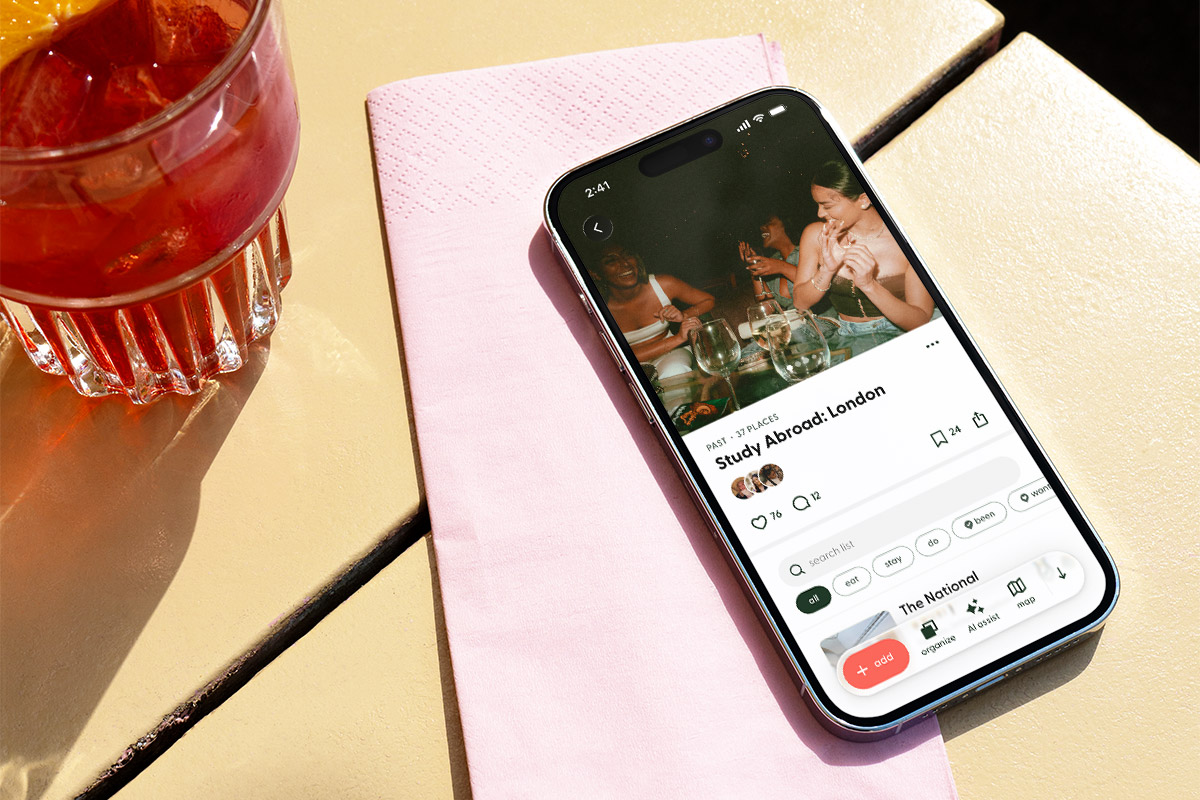
A smartphone rests diagonally on a folded pink napkin atop a cream-colored café table beside a glass of red-orange cocktail garnished with an orange slice. The phone displays a page from the Flaire mobile app featuring a social collection titled “Study Abroad: London,” with a photo of friends gathered around a table, engagement icons, and navigation controls visible on the screen. Bright sunlight casts strong shadows across the tabletop, creating a warm, lifestyle-focused scene.

Context

Gen Z’s social hub for travel

Flaire combines the trust of social proof with the convenience of AI, helping users discover recommendations from like-minded travelers, plan future trips, and capture and share their travel experiences—all in one place.

At launch, Flaire’s main feature was Lists—collections of places used to create itineraries, guides, bucket lists, and more (Figure 1.0).

My role: I was Flaire’s founding (and only!) designer, taking the app from inception to acquisition. The app launched in April 2025 and was acquired by Pangea in April 2026.

1.0A List, based on a trip I took :)
Video Loop

The Challenge

How might we help Gen Z travelers continuously capture their travel experiences between major trips, so that contributing recommendations feels like an ongoing habit rather than an activity tied only to a few annual vacations?

To build out its library of trusted recommendations, Flaire relied on users planning trips in the app and then returning afterward to log the places they’d visited.

However, most Gen Z travelers take only a few major trips each year, inherently limiting opportunities to contribute new recommendations and slowing the growth of Flaire’s recommendation dataset. It also meant that many users interacted with the app sporadically, making it difficult to establish lasting engagement habits.

Goals

  • Increase platform stickiness while continuously growing the recommendation dataset that powers personalized travel discovery
  • Better serve travelers who regularly explore locally

Key metrics

  • WAU/MAU
  • # places logged (marked as “been”)

Solution

A new main feature solely dedicated to logging individual places outside the ecosystem of Lists.
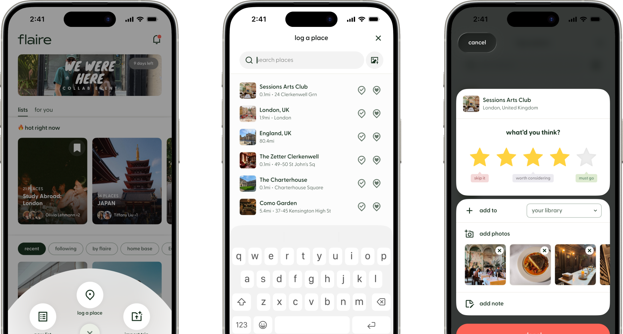
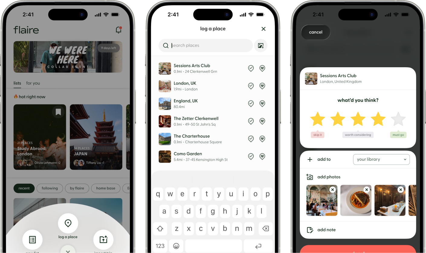
The Quick Log flow, shown left to right:
1. Home Screen with Quick Log Access: The Flaire home feed displays curated travel lists and recommendations. A radial menu expands from the center action button, presenting three primary actions: create a new list, import a trip, and Log a Place for quick travel tracking.
2. Log a Place: A streamlined search screen that automatically surfaces places near the user's current location. Users can quickly search for destinations or select from nearby results, then mark each place as “Been” and/or “Want to Go” with a single tap.
3. Rating Dialog: After marking a place as “Been,” a review dialog appears prompting the user to rate their experience using a five-star scale. Users can optionally add the place to a List, upload photos, and write notes, creating a richer record for themselves and the Flaire community.
The Quick Log flow, shown left to right:
1. Home Screen with Quick Log Access: The Flaire home feed displays curated travel lists and recommendations. A radial menu expands from the center action button, presenting three primary actions: create a new list, import a trip, and Log a Place for quick travel tracking.
2. Log a Place: A streamlined search screen that automatically surfaces places near the user's current location. Users can quickly search for destinations or select from nearby results, then mark each place as “Been” and/or “Want to Go” with a single tap.
3. Rating Dialog: After marking a place as “Been,” a review dialog appears prompting the user to rate their experience using a five-star scale. Users can optionally add the place to a List, upload photos, and write notes, creating a richer record for themselves and the Flaire community.

Overview

New feature:
Quick Log

Designed to be the “Shazam for places,” Quick Log enables users to instantly find and log places they’ve visited directly from the home screen. As a new core experience, Quick Log expands Flaire’s value beyond trip planning, giving users a reason to engage with the app even if they never create a single List.

Project Timeline
2 weeks design
2 weeks development
Launch Date
September 2025
worked with
Head of Product
After 6 months:
30%+
WAU/MAU
200k+
places logged
80%+
of users log 2+ places
2.0Quick Log flow
Video Loop

Designs

Optimizing the entry point

With the addition of Quick Log, it became important to surface multiple high-priority actions immediately upon opening the app. To accommodate this, I redesigned the entry point as a radial menu that provides quick access to key actions from a single tap.

Compared to a traditional list, the radial layout improves glanceability and spacial recognition by assigning each action a distinct position, making them faster and easier to locate (Figure 3.0). Interaction effort is further reduced by thumb-friendly positioning, while subtle animations and haptic feedback reinforce a fast, lightweight interaction.
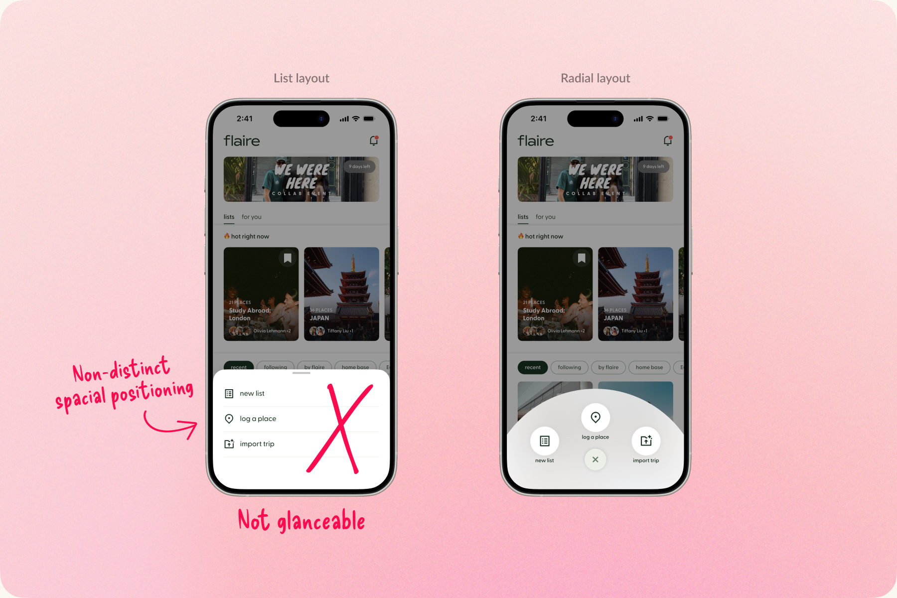
Side-by-side comparison of two menu patterns in the Flaire app. On the left, a traditional bottom sheet menu displays three actions—“New List,” “Log a Place,” and “Import Trip”—in a vertical list. Handwritten annotations label the design as “Not glanceable” and note its “Non-distinct spatial positioning,” highlighting that actions must be read and are harder to locate quickly. On the right, the same actions are presented in a radial layout, arranged around the center of the screen with icons and labels positioned in distinct locations. The comparison illustrates how the radial menu improves glanceability, spatial recognition, and ease of access compared to the list-based menu.
3.0Main action menu, list vs radial layout
Image

Designs

Effortless logging

The key challenge was to remove as many barriers as possible to finding and logging a place. The resulting experience automatically surfaces places nearby and auto-focuses the search bar, so users can quickly search for a destination or select from nearby results, then mark it as “been" or “want to go” with a tap.

3.1"Log a place" screen
Video Loop
An image upload icon corresponding to the "Get Place from Photo" feature.

Get Place from Photo

The “Get Place from Photo” feature leverages users’ natural tendency to remember places they’ve been by revisiting their photos. Originally introduced within Lists, it extracts place information from photo metadata and was the most frequently used method for adding places to past Lists. Bringing it into the Quick Log experience was a natural fit.

Minimizing Perceived Depth

Transition into the feature was designed to be fluid and fast. Opening as a sheet that quickly expands to full screen, users never feel like they've ventured deep into a separate part of the app.

Designs

Rewarding repeat engagement

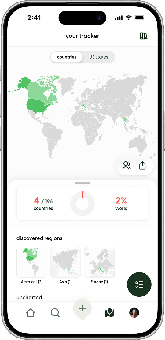
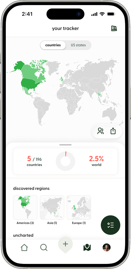
To encourage continued engagement, I connected Quick Log to an existing feature called the Tracker, a map that visualizes where users have been (Figure 3.3). As users mark more places as “been” within a country or state, that region becomes a deeper shade of green.

When a newly logged place advances a user’s Tracker level, the app celebrates their achievement with a notification and small burst of confetti (Figure 3.2). This ties logging behavior to visible progress and moments of recognition that feel meaningful without interrupting their experience.

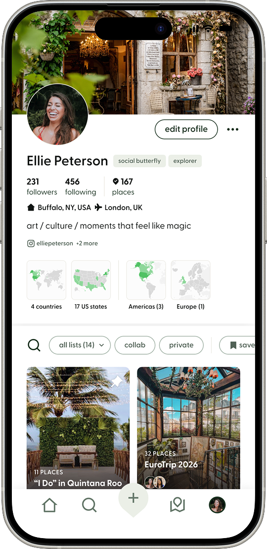
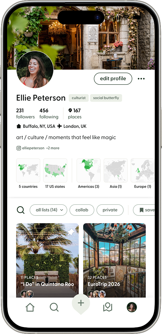
I also surfaced the total number of places a user has marked as “been” on their profile as a vanity metric to further reinforce their sense of accomplishment (Figure 3.4).
3.2Achievement notification
Video Loop
Flaire App screen of the Tracker: A personal travel map that visualizes countries the user has visited. Countries are shaded in green, with darker shades indicating a greater number of places marked as “Been” within that country. The screen also shows travel statistics, regional progress, and discovery summaries.
3.3Tracker
Image
A Flaire App screen of a user's profile featuring a cover photo, bio, follower metrics, the number of places they've logged, and traveler-type badges based on the user’s quiz results. The profile includes preview thumbnails of the user’s Tracker by region, as well as Lists they've created.
3.4User profile
Image
3.2Achievement notification
Video Loop
Flaire App screen of the Tracker: A personal travel map that visualizes countries the user has visited. Countries are shaded in green, with darker shades indicating a greater number of places marked as “Been” within that country. The screen also shows travel statistics, regional progress, and discovery summaries.
3.3Tracker
Image
A Flaire App screen of a user's profile featuring a cover photo, bio, follower metrics, the number of places they've logged, and traveler-type badges based on the user’s quiz results. The profile includes preview thumbnails of the user’s Tracker by region, as well as Lists they've created.
3.4User profile
Image

More screens from the app

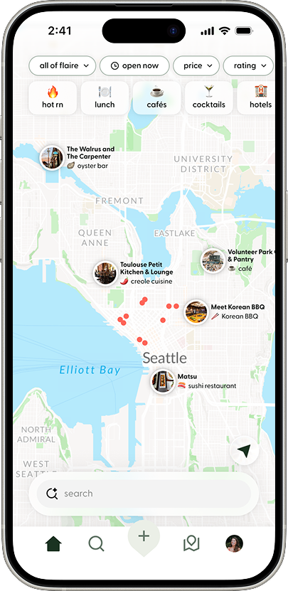
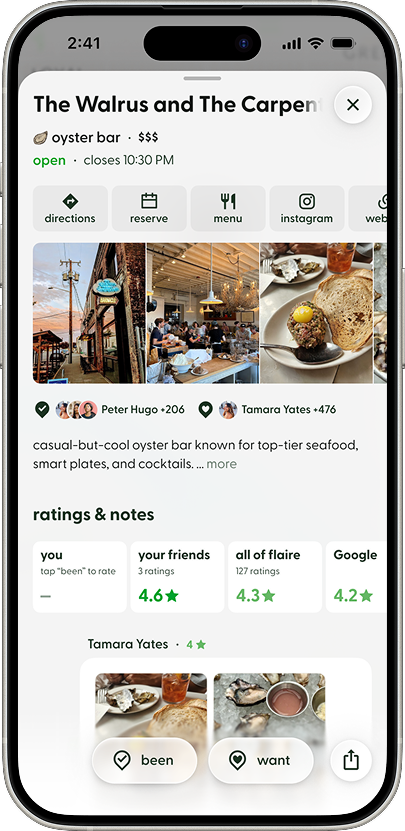
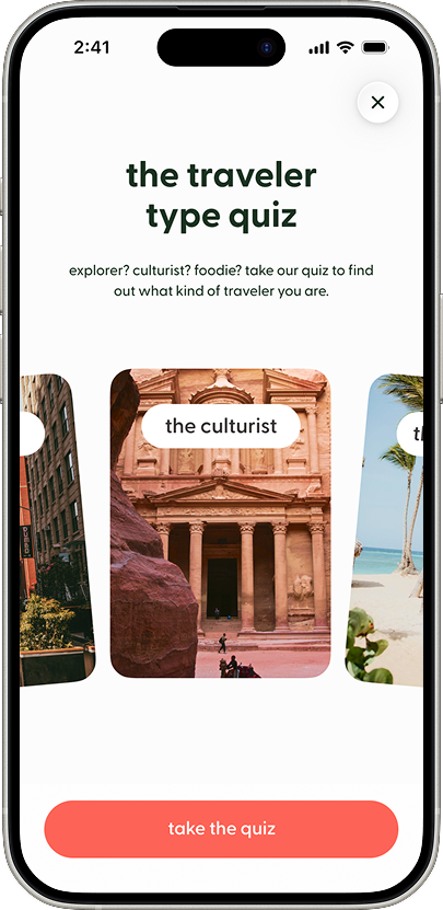
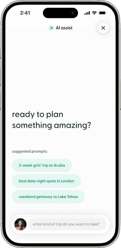
Flaire app screen of an interactive map displaying recommended places with photo-based pins and category filters across the top. Users can explore nearby restaurants, cafés, hotels, and other destinations, search for places, and discover locations saved or visited by the Flaire community.Flaire app screen of a detailed place page featuring photos, basic information, and quick actions such as directions, reservations, menu, and social links. Users can mark the place as “Been” or “Want to Go,” see how many Flaire users have saved or visited it, view community ratings and reviews, and browse photos and notes shared by other travelers.The Traveler Type Quiz screen in the Flaire app. A large headline reads, “The traveler type quiz,” with supporting text inviting users to discover what kind of traveler they are. Below, a horizontally scrolling carousel displays visual traveler archetypes represented by full-bleed destination photography. The centered card, labeled “the culturist,” features an image of Petra in Jordan, while adjacent cards are partially visible on either side. A prominent “take the quiz” button appears at the bottom of the screen, and a close button is positioned in the upper-right corner. The quiz helps users identify their travel personality, which is later displayed on their profile and used to personalize recommendations.The AI Assist screen in the Flaire app, designed to help users create travel Lists using AI and Flaire’s recommendation dataset. A large prompt asks, “ready to plan something amazing?” followed by suggested trip ideas such as a two-week girls’ trip to Aruba, date night spots in London, and a weekend getaway to Lake Tahoe. At the bottom of the screen, a chat input field invites users to describe the type of trip they want to take. The AI assistant generates personalized Lists by combining user intent with recommendations sourced from the Flaire community. A close button appears in the upper-right corner.
Back to Top